Posts: 4170 |
paul_c Posted Tue 05 Aug, 2008 4:35 PM |
Fran wrote: Also it seems that with all the change; new label, new direction, new underwear etc a new font felt right.
aaaanyways...
You mean you've had the same undies on since 1996?! Sick!! haha |
|
|

Posts: 564 |
kiwi Posted Tue 05 Aug, 2008 8:48 PM |
Simple = beautiful, in this case.
I really like it. I hope there will be posters available. |
|
|

Posts: 10115 |
ricv64 Posted Tue 05 Aug, 2008 8:59 PM |
kiwi wrote: Simple = beautiful, in this case.
I really like it. I hope there will be posters available.
yeah some silkscreen metalic ink on 12point covered stock . I know where that could be done |
|
|

Posts: 1726 |
Somewhere Else Posted Tue 05 Aug, 2008 10:01 PM |
kiwi wrote: Simple = beautiful, in this case.
I really like it. I hope there will be posters available.
Hey yea , I'd like one too :) |
|
|

Posts: 41 |
yonan Posted Wed 06 Aug, 2008 2:46 AM |
paul_c wrote: glennr2008 wrote: I think the new logo is really good! The slanted A's and Vs are probably copywrited by the old record label and with this record being "a new lease of life" for the band, im guessing that means a new identity on the artwork too.
Explain this, then...

J. Smith EP was a one-off thing to emulate their AIWTDIR release, right? they're making the design similar to achieve that. once we're off that, time for a new life :) |
|
|

Posts: 765 |
erikausagi Posted Wed 06 Aug, 2008 4:53 AM |
I like Something anything artwork, simple, but nie, I'll miss the usual Travis font this look so simple, but Fran is right, there's several companies and bands using the same font...
so,new label, new font, new direction and new artwork too?? so, can we expect for the upcoming singles and of course Ode to J Smith?? (and this eye that just scares me!!)
|
|
|

Posts: 1531 |
lilly Posted Wed 06 Aug, 2008 5:44 PM |
aaaahhhh, I'm so relieved! I really like this one.
(cause I don't like the style of the new album cover much) |
|
|

Posts: 523 |
damon Posted Thu 07 Aug, 2008 3:45 PM |
Fran wrote: Cool, Looks really good. The Travis logo is still in use too. It's our logo. Like the Nike swoosh :) Nobody owns that font. We own our name though (phew). We thought we'd use a different font for this album because lately we been seeing that font (avant garde) used by loads of bands and companies and magazines... it seems to be everywhere. Also it seems that with all the change; new label, new direction, new underwear etc a new font felt right.
aaaanyways...
i love travis logo !!!
if i don't see it in the album i'm going to miss it !,,,
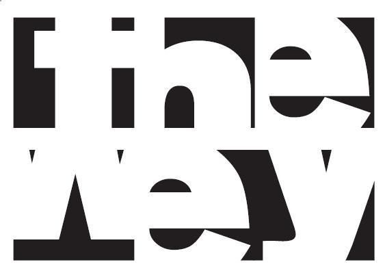
here my band's logo (wey is the way we call ourselves in mexico to any guy, like dude, mate, bro, you know)
 |
|
|

Posts: 4170 |
paul_c Posted Fri 08 Aug, 2008 2:31 AM |
yonan wrote: paul_c wrote: glennr2008 wrote: I think the new logo is really good! The slanted A's and Vs are probably copywrited by the old record label and with this record being "a new lease of life" for the band, im guessing that means a new identity on the artwork too.
Explain this, then...

J. Smith EP was a one-off thing to emulate their AIWTDIR release, right? they're making the design similar to achieve that. once we're off that, time for a new life :)
Except that point isn't really valid cos the original AIWTDIR release didn't have (nor did any of the early Travis releases from Good Feeling have) the Travis logo anywhere on it
So, i guess, you don't have an argument there! |
|
|

Posts: 7556 |
I Came in Through the Bathroom Window Posted Fri 08 Aug, 2008 2:45 AM |
ricv64 wrote: Nikki wrote: ricv64 wrote: Nikki wrote: It's a heart with two holes in it. At least that's what I see. That's why it's so cool...you can make it whatever you want. It's art! :)
what a hippie thing to say .
edit , FRAN too heh heh heh
:P Watch it, Ricardo.
peace the you know what out , mazn
Lol! You guys made me laugh xD.
Nikki, you're not a dork. I got excited as well the only time Fran quoted me... Or maybe I'm a dork too. That's very possible :oP. |
|
|